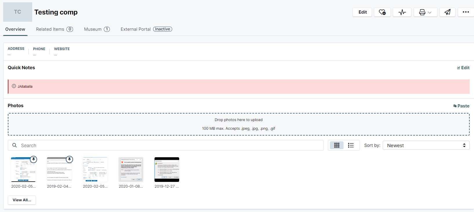
Move Photo gallery to Core assets or tab on company
A different tab up at museum and relater items or on the left side with the core assets would be fine with me.
Also feel the «drag photos here» takes up to much space
If you have more quick notes the magic dashes would you need to scroll down for
Log in to comment and vote
Comments5
Jan 25, 2024
Photo gallery has been moved to the right-hand company sidebar as a "Tool"
Aqua Reindeer
Nov 23, 2023
I prefer the ITGlue option to create a gallery in the company specific KB for items like server room photos and such.
Oct 26, 2023
Amber Fuelcell
Sep 30, 2023
Agreed. Uses up a lot of space and not even sure what photos we would post here that at this size would really be helpful. Feels like a solution in search of a problem. Most of our images that we’d even want to use here are ok KB articles, not Assets.
The drop zone could just be an Upload button next to the Paste button as well.
Red Handle
Oct 26, 2023
Kevin L.: This solution is one that I have been begging for for two years, FWIW. If you drop images on assets (cabinet, switch, router, server), this is an aweseome way to get all your images in one place to make them easier to find.
Personally, I don't care where it is displayed, but my whole team was happy that it finally got added!